References - Grano — 4.02.2020 — min read time
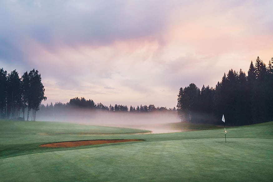
Located by the seaside near the border between Kirkkonummi and Espoo, Sarfvik Golf is one of Finland’s most prestigious golf clubs. Its premise is to provide members with a stress-free golfing experience. This experience is strengthened by the club’s recently updated visuals, which were systematically and successfully implemented in everything from the club’s logo to golf cart decals.
There is always time. This is Sarfvik’s promise, which in practice serves as the core of the legendary golf club’s brand. Sarfvik has gained a reputation as the most expensive, partly even exclusive golf club in Finland, which is held in high regard for a reason: the courses are first-rate and well-maintained, the environs are peaceful and, most importantly, never busy.
The club’s peacefulness is based on high membership fees, which nevertheless provide excellent value for money. The club’s two rather different 18-hole-courses are available to club members without the stress of having to book a tee-time in advance. In other words, the club’s core idea is clear, but over time its visual presentation had become outdated. The club’s visuals were also not always consistently applied across different materials.
The thing that finally prompted the updating of the club’s image and visual materials was the renewal of its ageing tee signs and other signage. Why not update the entire brand at once and concretise it in a professional manner?
From idea to implementation, applying the new visuals in practice
Managing Director of Sarfvik Golf Staffan Tuomolin is happy with the update. The logo, visuals and concrete implementations are now in line with Sarfvik’s core promise of stress-free playing.
“We started by updating our club’s visual appearance. To this end we decided to partner with the design consultancy Kuudes, who came up with the new logo, visuals and website,” Tuomolin explains.
“We strongly identify as a private club, so our website also offers more services and content to members.”
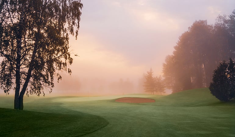
The golf club’s new logo symbolises contour lines and differences in height, which are genuinely large at Sarfvik. The lines and colours of Designer Iikka Koistinen seamlessly communicate Sarfvik’s character: the physical shapes of the courses are repeated in all of the club’s graphical elements. The dignified colour of sand and dialogue with black also make the overall appearance stand out from the traditional approach of emphasising greenery.
“All these aspects are reflected and made concrete in even the smallest details, right down to the tickets. The peaceful overall appearance emphasises openness and stress-free playing,” Tuomolin describes.
It was important to also make the new appearance visible on a larger scale. The partner selected to help with this was Grano, which was tasked with concretising the brand in the form of business cards, golf cart decals and service desk and window decals.
“Working with Grano was smooth. We received good service, reached an understanding on our overall needs quickly and were able to proceed with the project immediately,” Tuomolin praises.
That’s not to say that there weren’t any challenges. The inspiration for the sand colour came from bunkers, but the specific tones were not available in any Pantone colour charts. Finding the right tone took quite a bit of work.
“The stylish sand tone is technically challenging, and translating it to print was no easy task,” says Key Account Manager Petri Leiste from Grano, who coordinated the cooperation between the two companies.
Updating your brand is worth it
Sarfvik is a textbook example of how to update a brand right down to the smallest details. However, the process of doing so is by no means simple.
“You shouldn’t update your brand just for the sake of updating it,” says Staffan Tuomolin from Sarfvik.
According to him, the most important thing is to find a unique profile for your course and club on the basis of which to proceed. Any logo updates and concrete implementations of visuals should be based on this profile.
“High-quality updates are also not something that can be carried out quickly, or for free. If you’re planning a comprehensive and professional update, you should also make sure to reserve enough time for the project,” Tuomolin emphasises.
Thorough planning also opens up possibilities for all kinds of future needs, from competition materials to co-branding and other types of versatile visibility.
“We’re not going to run out of needs anytime soon. There are all kinds of visual elements both big and small that we still need to work on, from cards to signs,” Tuomolin laughs.
All in all, he is very pleased with the investment in the brand update.
“This was absolutely a thing worth doing.”