References - Grano — 4.02.2020 — min read time
For its 10th anniversary, Shopping Centre Skanssi decided to update its signposting and add a splash of colour in the process. The modern colour signposts freshen up the shopping centre’s appearance and make it easier for customers to navigate the shops. Grano was tasked to come up with the right materials and ways of implementing the client’s wishes.
Where on earth did I park my car? Every row of cars looks the same, so you end up running up and down the grey car park in confusion. There’s no shortage of shopping centre customers who have found themselves in a similar situation.
Shopping centre signposting is a challenging art form. It is no use having a diverse range of shops and attractive sales campaigns if the customer cannot find what they are looking for.
Located in Turku, Shopping Centre Skanssi features nearly a hundred shops, restaurants and services and over 38,000 square metres of commercial space. In addition to serving as the local shopping venue of the residents of the rapidly growing district of Skanssi, the shopping centre, which is located right near the city centre by the highway, also attracts plenty of visitors arriving from further away by car or public transport.
“Signposting has a major impact on how people perceive public spaces. One of the core values vis-à-vis our customer experience is convenience. Even though the shopping centre covers a large area, customers are able to find what they are looking for,” Skanssi’s Shopping Centre Director Maarit Hurme explains.
The premise of the Skanssi signposting project was to ensure that customers would be able to quickly locate the nearest entrance and easily return to the right place once they were done shopping.
“Signposting is an essential element in the perceived pleasantness of a shopping centre. The last thing you want is to make customers anxious,” says Sales Manager Jaana Viitanen from Grano.
From the client’s idea to consistent implementation
Skanssi had a clear demand for Grano: the different areas of the shopping centre should be individually colour-coded. The entrances of the shopping centre, which was celebrating its 10th anniversary, were already colour-coded in the original architectural plans.
“Over time, we noticed that the original implementation was too subtle for customers to grasp. With this in mind, we wanted to make it even easier for customers to navigate the already accessible shopping centre,” Hurme says.
Hurme calls the objective airport signposting. It is comprehensive, yet simple. Instead of guiding customers to individual shops, the idea was to clarify the movement of large customer flows.
“The idea and impulse came from the client. They had a clear idea of what they wanted the signposting to look like. Our job was to come up with the right materials and ways of implementing their wishes,” Viitanen says.
Grano worked together with the shopping centre to determine how much signposting was needed to achieve the desired level of visibility and what materials were best suited to different surfaces. The eight-week signposting job was a lot of project to manage. There were transparent colour schemes suitable for glass surfaces to find, drafts and models to prepare and installation timetables to work out.
“We received good colour samples and sparred about the implementation together. We appreciate Grano’s professionals being able to assess the usability and sustainability of different materials. Skanssi is known for its social responsibility efforts, which is why we want our choices to be sustainable,” Hurme says.
Effective signposting is impossible to miss
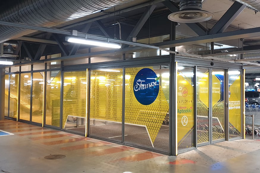
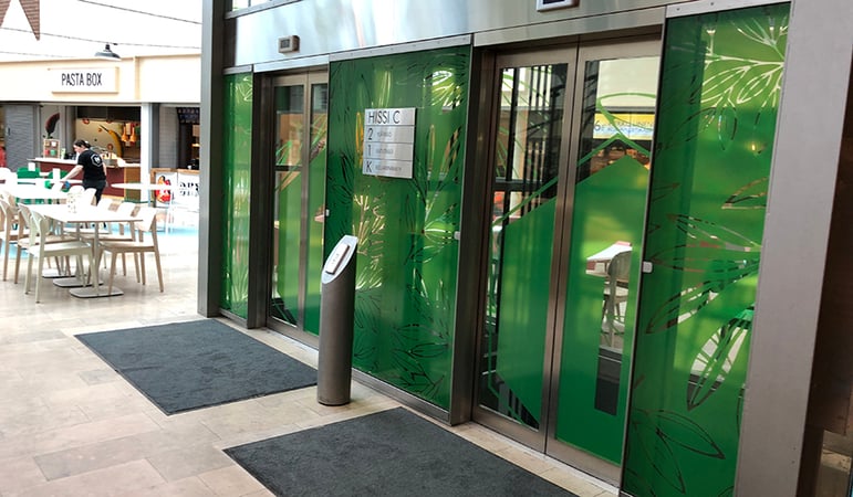
The most challenging part of the project was the installation. The car park entrances, lifts and the glass lift shaft in the middle of the shopping centre were processed in the quiet hours of the early morning and late evening so as not to disrupt customer flows. The car park is now adorned in red, pink, yellow, green and blue, with the colours extending from the car park to the entrances of the shopping centre.
The colours chosen ten years ago by the original architect were intensified. Previously limited to appearing on the outer edges of numbers or light lines, the colours were expanded to glass surfaces in accordance with the shopping centre’s visual appearance.
“Completed in June, the end result is a success in terms of both refreshing the shopping centre’s appearance and serving as effective signposting,” Viitanen says.
Now, customers visiting Skanssi are greeted by a clear, fresh and modern ten-year-old shopping centre. If you park your car in the pink area, you reach the shops by taking the pink lift. And even if you spend hours exploring all the shops, the pink entrance is easy to locate from afar.
“We are very happy with the implementation. The end result is most clearly visible in the car park, the change of which customers have also noticed. We have received happy and positive feedback especially about how fresh the updated visuals are,” Hurme says.